New Design System for The World’s Leading Lighting Brand
New Design System for The World’s Leading Lighting Brand
Profoto, Visual Identity & Packaging
Profoto, Visual Identity & Packaging
Profoto is the world’s premiere flash company. The company was facing its two most important product releases ever, but the brand identity was all over the place. We helped them create a new brand from the ground up.
Profoto is the world’s premiere flash company. The company was facing its two most important product releases ever, but the brand identity was all over the place. We helped them create a new brand from the ground up.
Rebuilding the Brand
Rebuilding the Brand
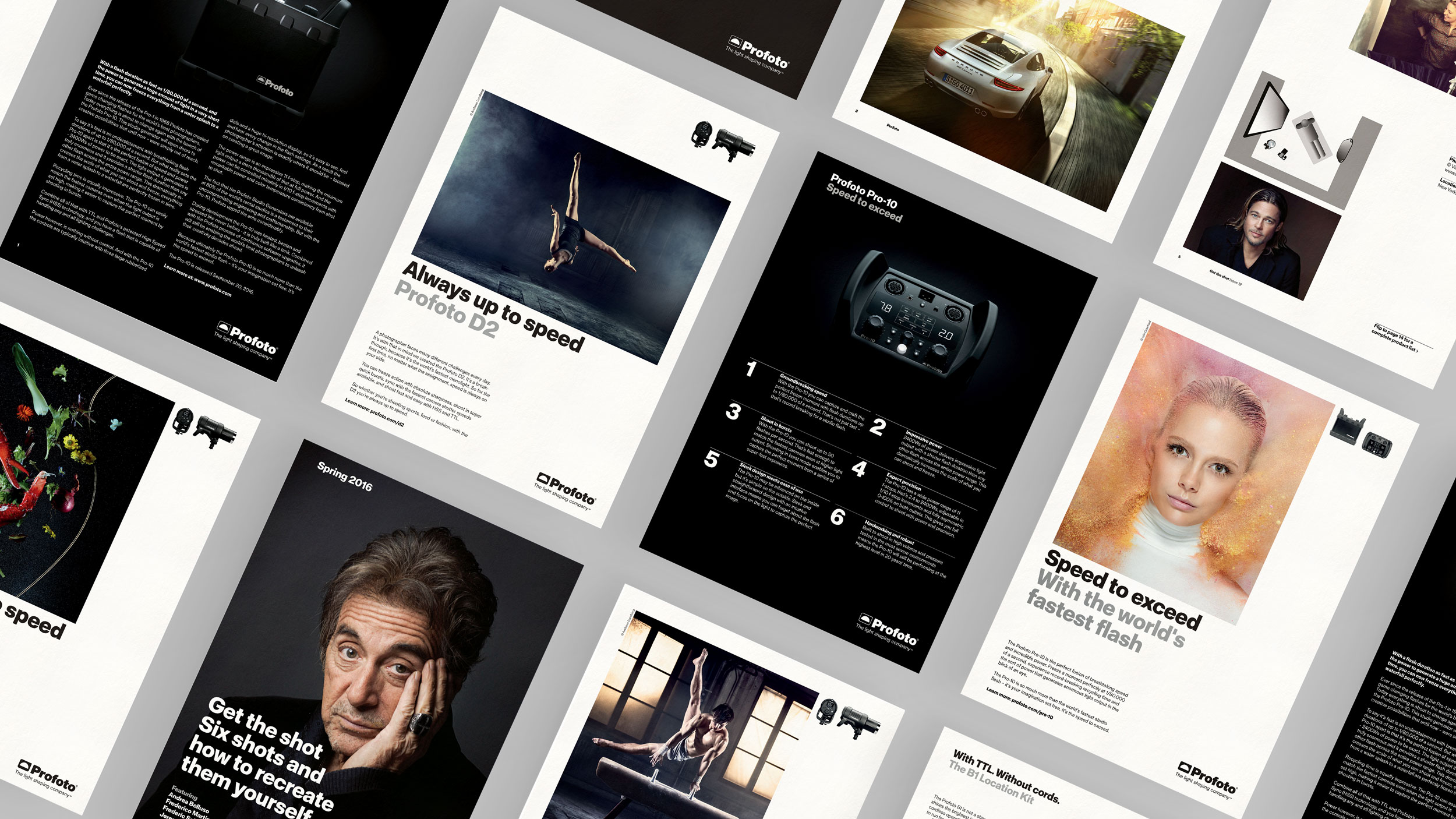
Our ambition when we started the project together with Profoto was to reiterate the brand from the ground up. To rebuild every visual asset, and the way they interact, in all touch-points. Logo, custom typeface, banners, print ads, motion, brochures, newsletters, packaging, in-store material and so on. No stone was left unturned.
Our ambition when we started the project together with Profoto was to reiterate the brand from the ground up. To rebuild every visual asset, and the way they interact, in all touch-points. Logo, custom typeface, banners, print ads, motion, brochures, newsletters, packaging, in-store material and so on. No stone was left unturned.

Making the Products Shine
Making the Products Shine
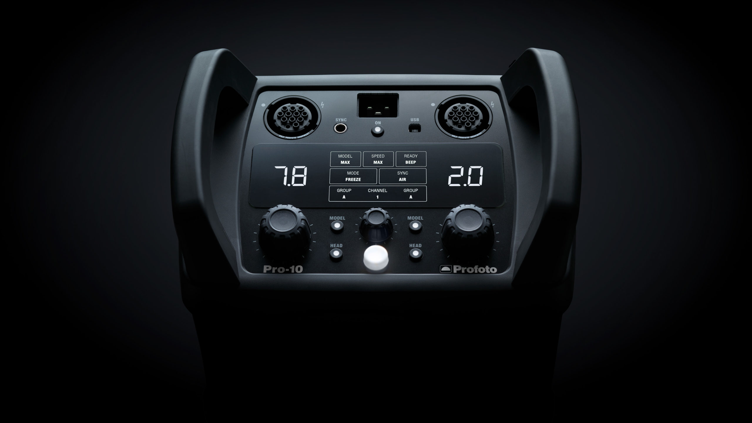
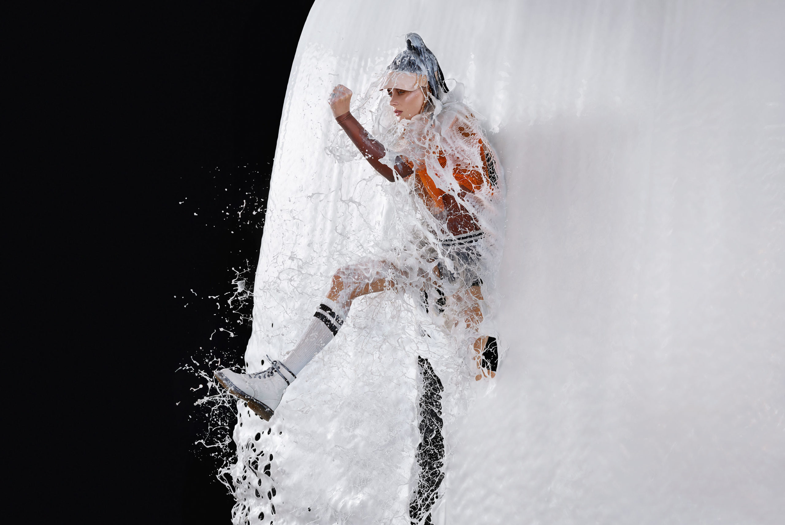
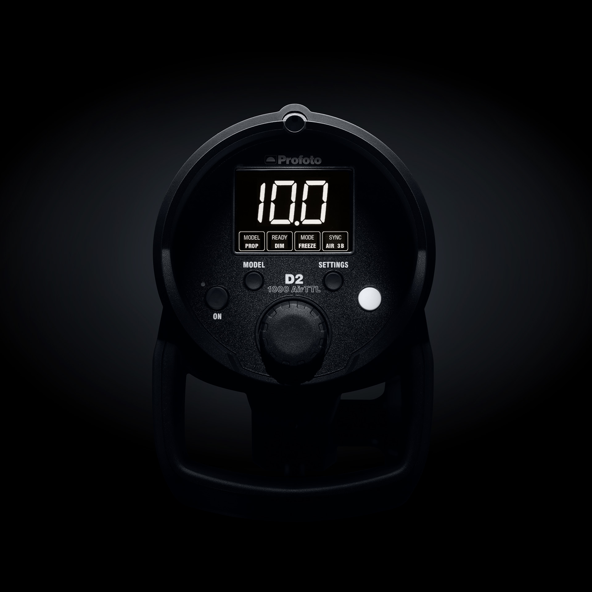
Since Profoto’s products are used by professional photographers, it follows that their own product photography must be world class. With subtle yet dramatic lighting, we made the lighting products shine.
Since Profoto’s products are used by professional photographers, it follows that their own product photography must be world class. With subtle yet dramatic lighting, we made the lighting products shine.
An Identity for Craft Perfection
An Identity for Craft Perfection
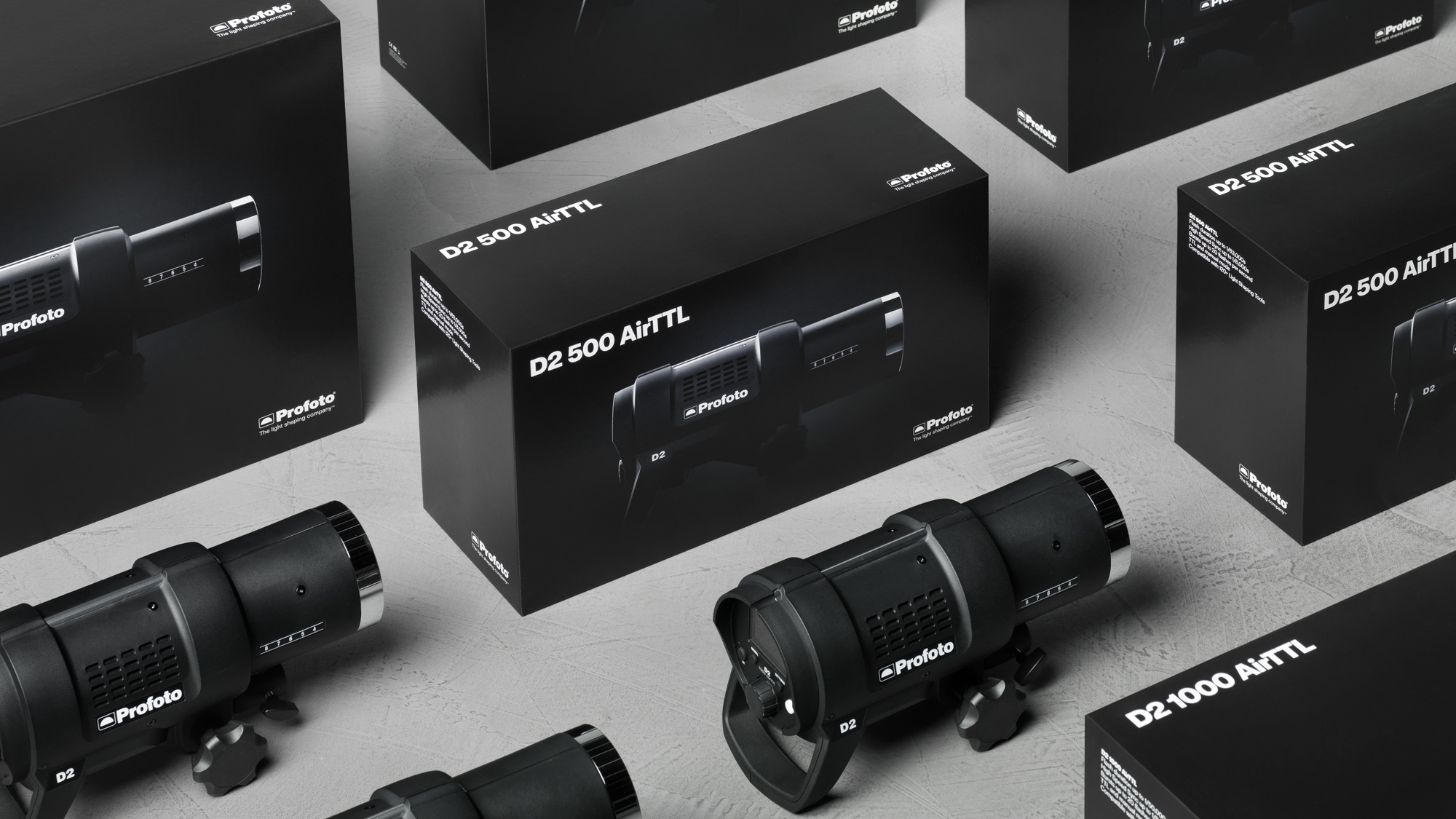
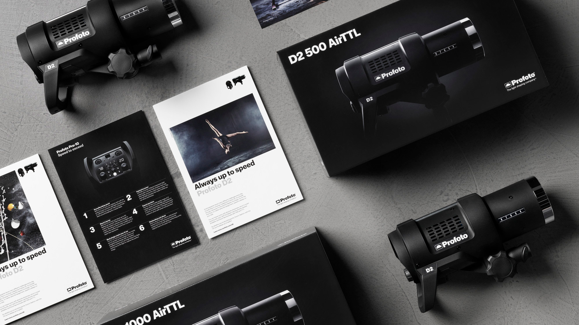
We worked together with the team at Profoto to develop a new visual identity including a new bespoke typeface, new iconography, grid-system and product imagery. We developed new templates for every touch-point and finished off with a new packaging concept. The result is a global brand as premium as its products.
We worked together with the team at Profoto to develop a new visual identity including a new bespoke typeface, new iconography, grid-system and product imagery. We developed new templates for every touch-point and finished off with a new packaging concept. The result is a global brand as premium as its products.
