A New Home for Online Groceries
A New Home for Online Groceries
Coop, Product Design
Coop, Product Design
Coop is one of Sweden’s largest grocery chains, we brought their e-com into the new era of online retail.
Coop is one of Sweden’s largest grocery chains, we brought their e-com into the new era of online retail.



A Paradigm Shift
A Paradigm Shift
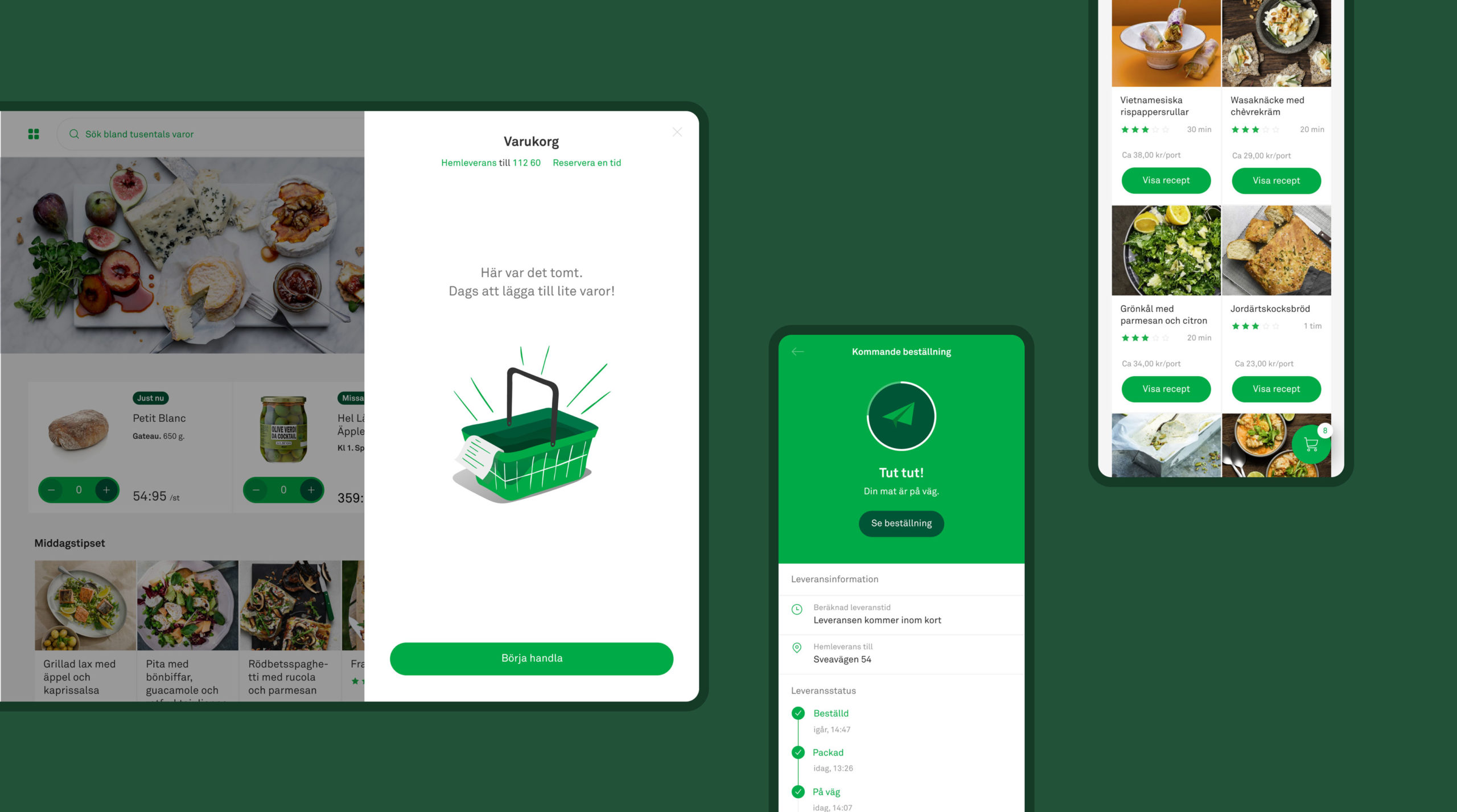
Grocery shopping has taken a new turn in this 21st century with the advent of online shops. A well-oiled infrastructure has become integral for the physical retailer’s survival, as new actors enter the market everyday. When redesigning their e-com, we focused on developing and simplifying the digital customer experience, whether it be the implementation of an entire visual overhaul down to the elimination of a click.
Grocery shopping has taken a new turn in this 21st century with the advent of online shops. A well-oiled infrastructure has become integral for the physical retailer’s survival, as new actors enter the market everyday. When redesigning their e-com, we focused on developing and simplifying the digital customer experience, whether it be the implementation of an entire visual overhaul down to the elimination of a click.
Laying the Foundation
Laying The Foundation
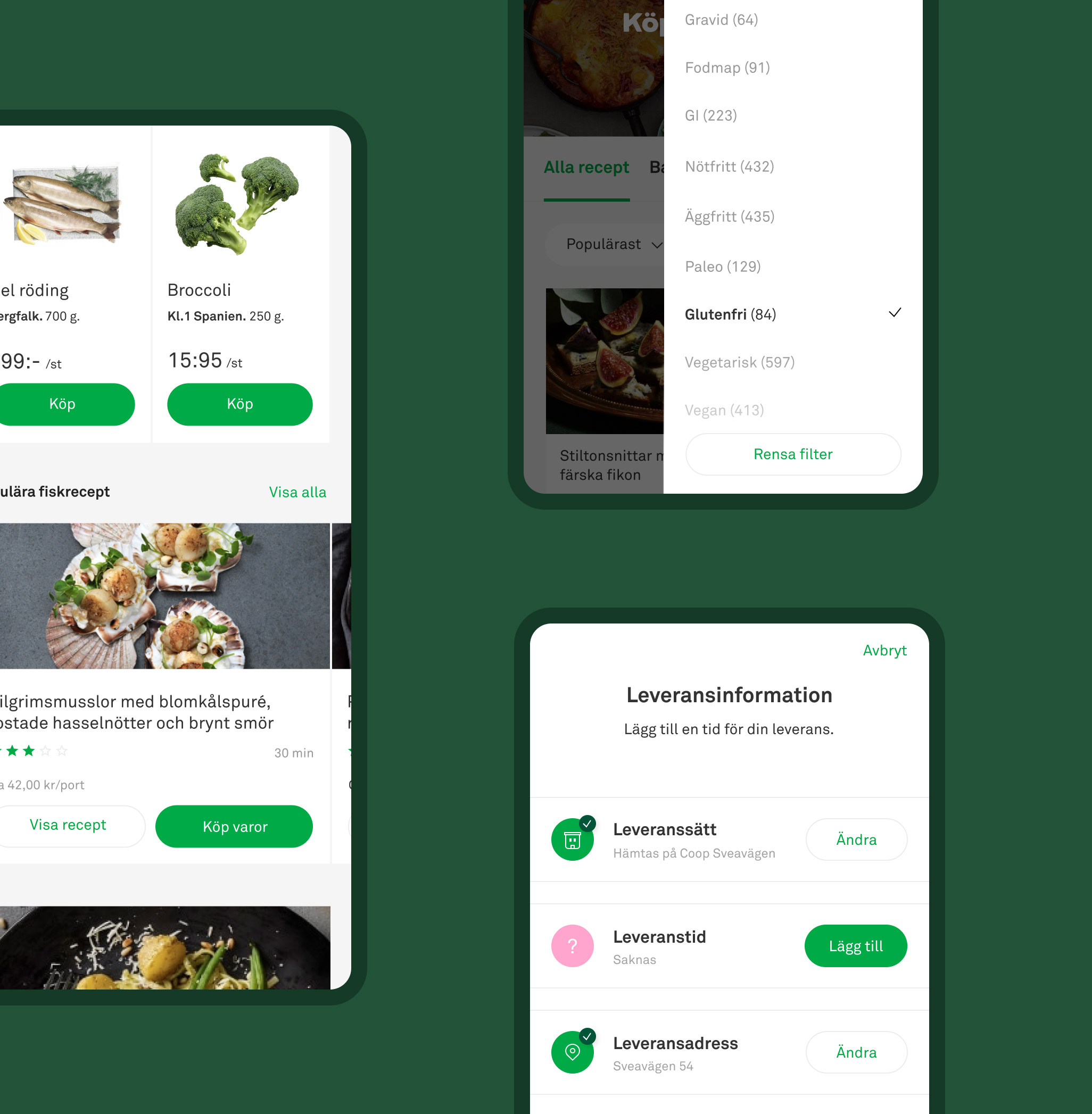
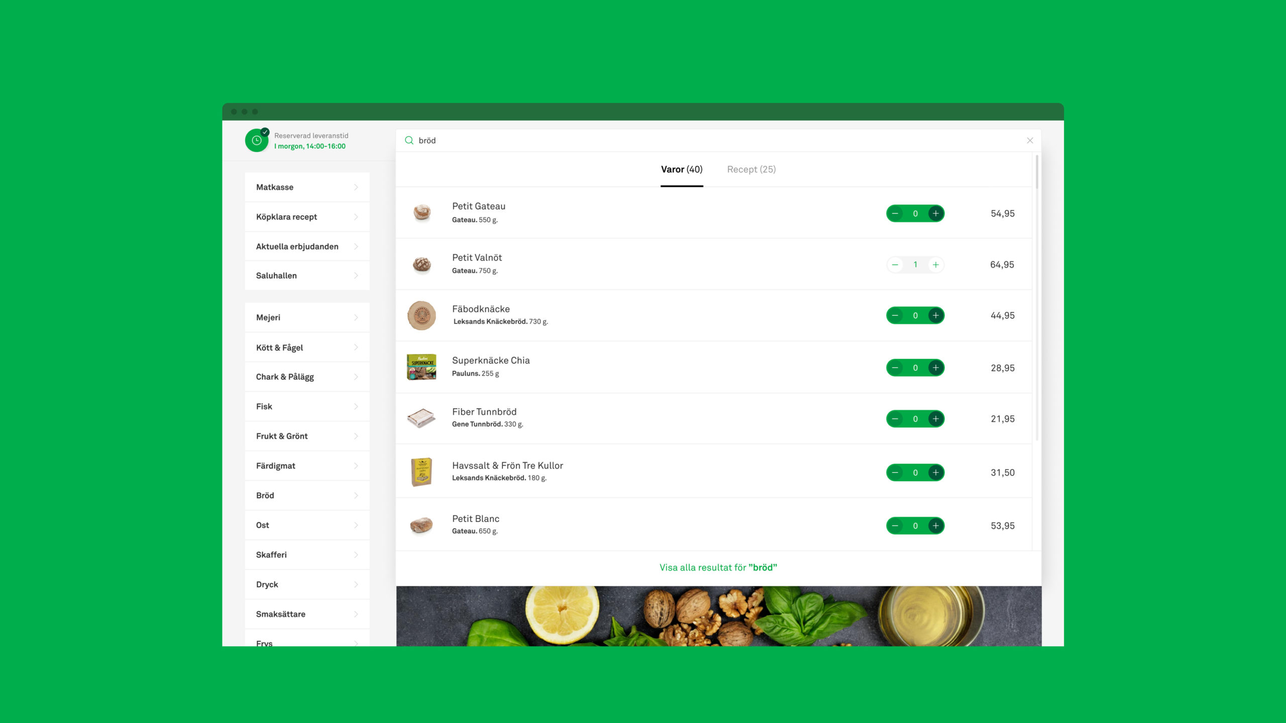
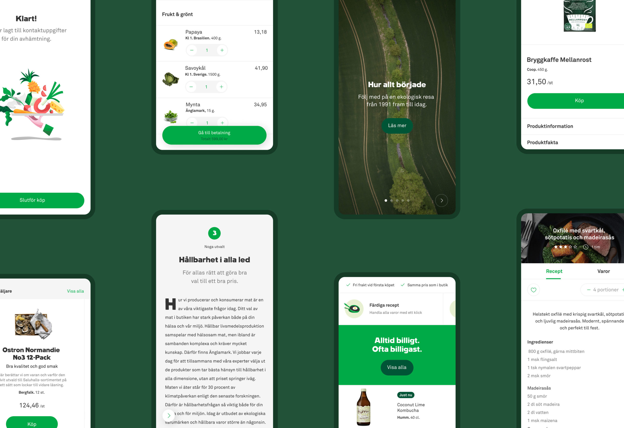
How do you make browsing over 25,000 products not only easy to understand but also inspirational? The first step was to lay a solid foundation for future updates, tweaks and ongoing development. With a complete visual overhaul of the old e-com, we made sure that the entire shopping journey was as, if not more, intuitive as picking out products at the physical store.
Once in place, our focus shifted to ironing out a framework for implementing inspirational features such as recipes, meal kits and editorial content – ensuring the conversion potential along every step of the way.

Bringing It All Together
Bringing It All Together
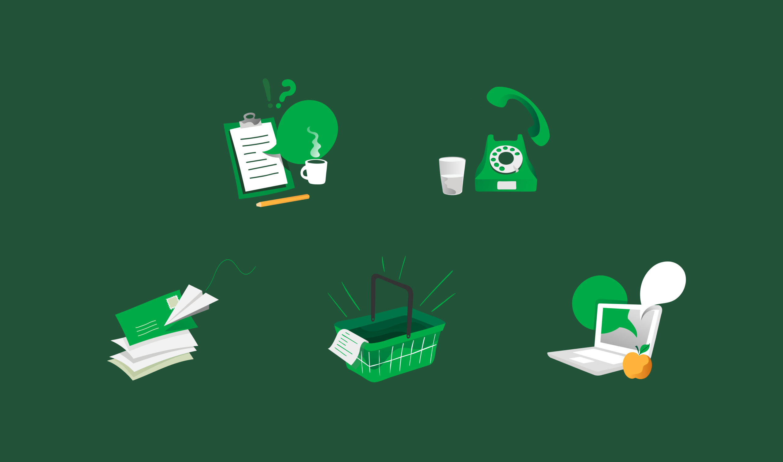
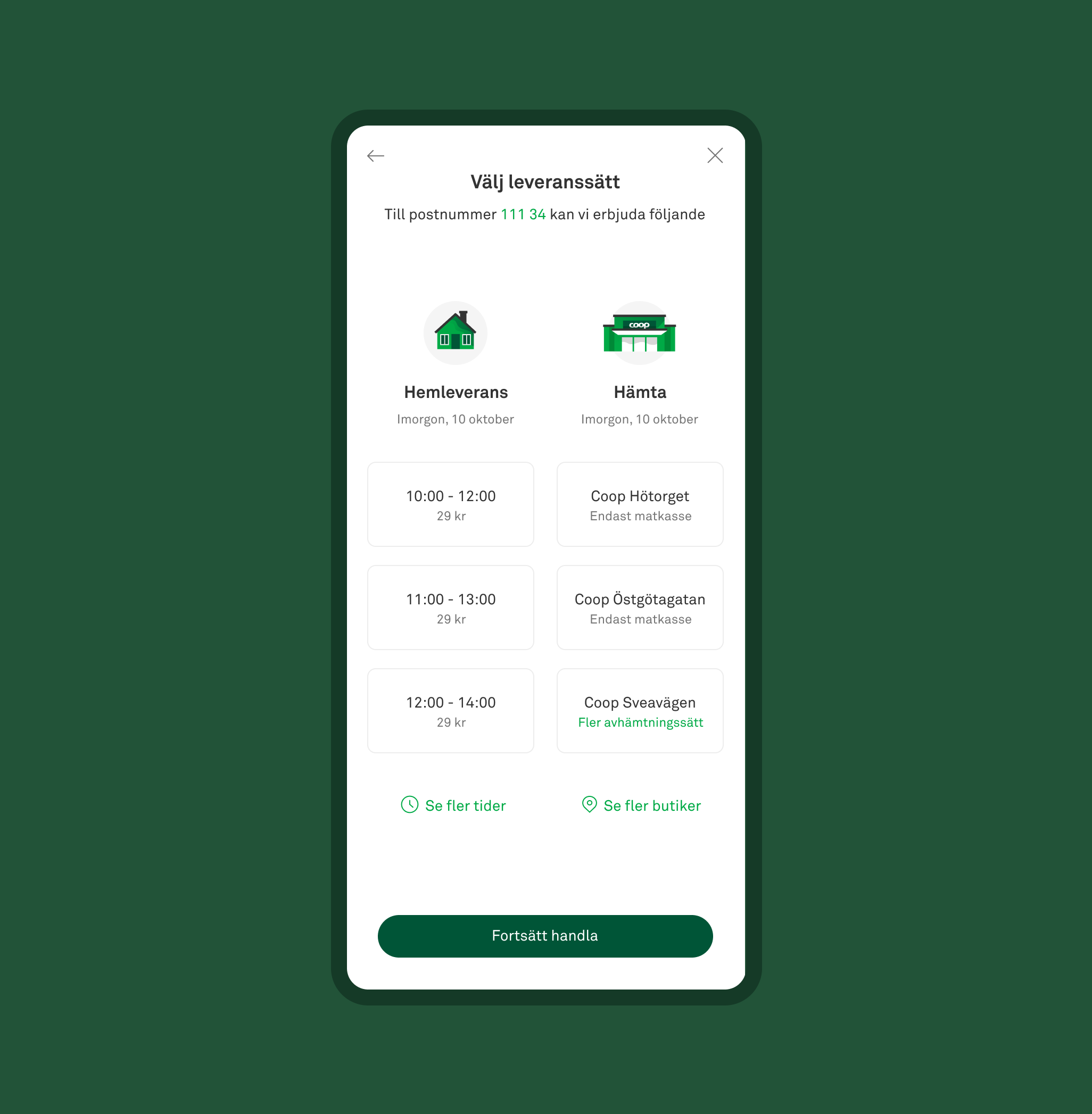
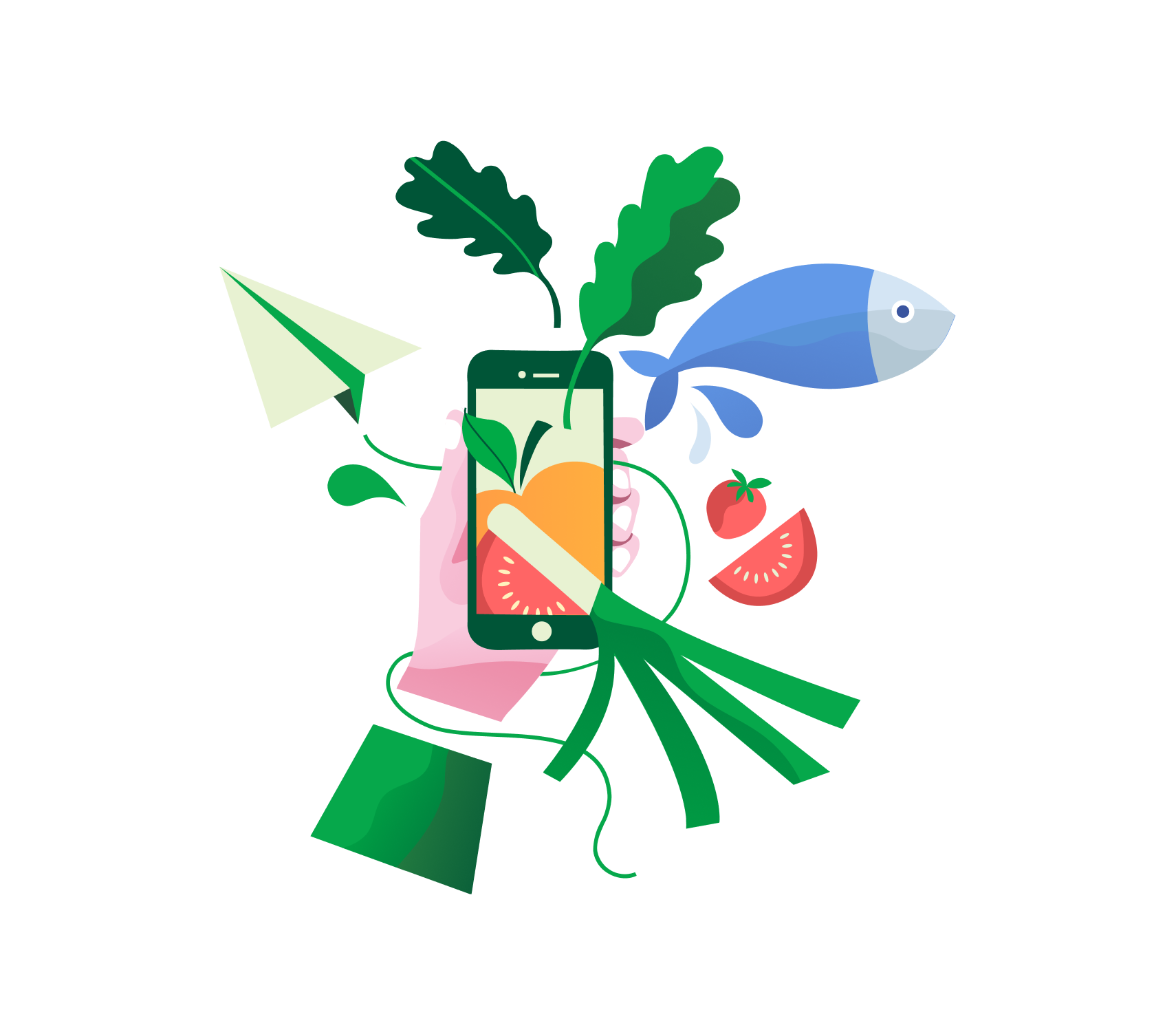
As the new site was coming to life it became apparent and increasingly important to maintain a consistent style and visual language across all areas of the product. With the introduction of new illustrations, iconography and a bespoke tone of voice, we ensured an easy-to-get, unified customer experience while staying true to the Coop brand.
As the new site was coming to life it became apparent and increasingly important to maintain a consistent style and visual language across all areas of the product. With the introduction of new illustrations, iconography and a bespoke tone of voice, we ensured an easy-to-get, unified customer experience while staying true to the Coop brand.
